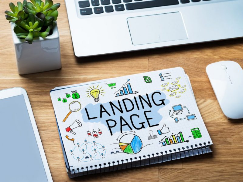
While promoting an app it’s necessary to pay attention to a landing page. It’s a peculiar bridge between the web and mobile app environments. You should direct to it all the traffic collected on the internet. Let’s discuss it in a more detailed way.
Contents
Creation of a landing page
Two types of landing pages
Landings may be divided into 2 fundamentally different types:
- Collectors of applications for install (are placed before an app release).
- A landing page with a link to an app (is placed at launching).
In the previous article, we wrote that promotion starts long before the app launch. The first type of landing is needed for this stage. On such page publishers usually tell about the app and its purpose and offer visitors to leave their e-mail or phone number in order not to miss the release moment. Thus, the user base is collected before the release.
The second stage is for the immediate transfer of traffic to the app. I.e.users are offered to install the app at once.
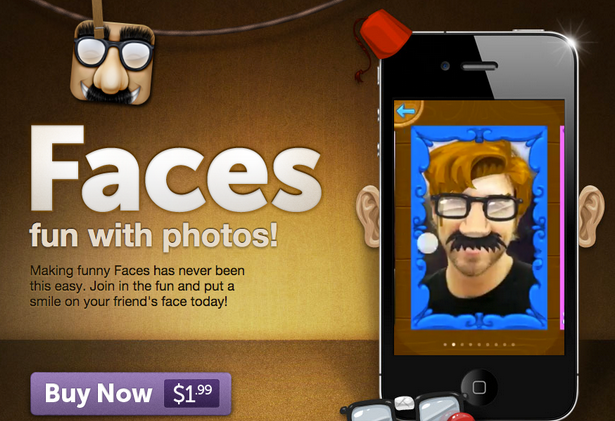
How a landing should look like?
The main qualities of a successful landing page:
- Minimalism. The most important function of landing is to transfer a visitor to an app installation. Don’t create a multipage website in order not to confuse users.
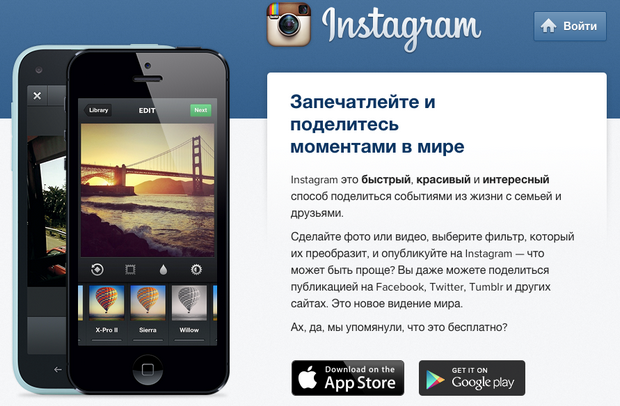
- Brightness and appeal. The main goal is to interest a user. A boring and ordinary design can’t do it.
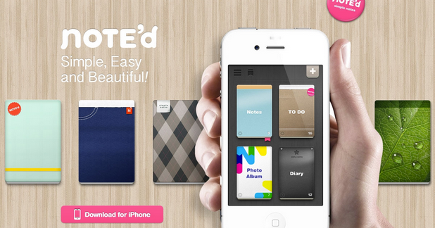
- Maximum of information in graphic form. Don’t overload your landing page with text. Almost nobody will read it attentively. That’s why it’s better to give information in clear graphic form.
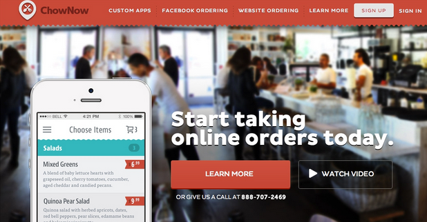
- Informativity. A visitor of your landing should understand at once what app is offered to install. So here’s an important rule: no unnecessary reasonings, only the most juicy information about the app.
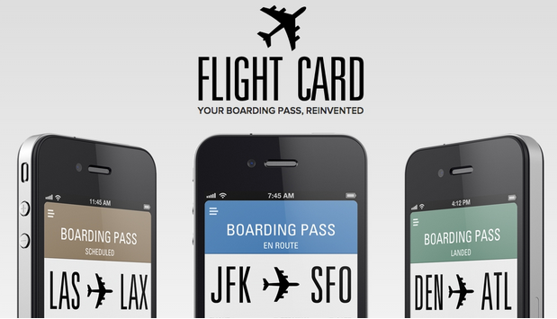
- Cross-platform. Users may get to your landing page from various devices. Many may open it both on smartphones and tablets. That’s why you should take care of landing adaptation for screens of different sizes beforehand.
Structure of a landing page
Most of the time only one landing page is enough. Several landing pages may confuse a user and distract from the main goal — an install. How to place all the information on a sole page? You may organize several horizontal blocks which will be logical sections of a landing.
What a landing may include?
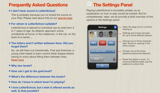
- FAQ — a user can understand the essence of the app with its help.
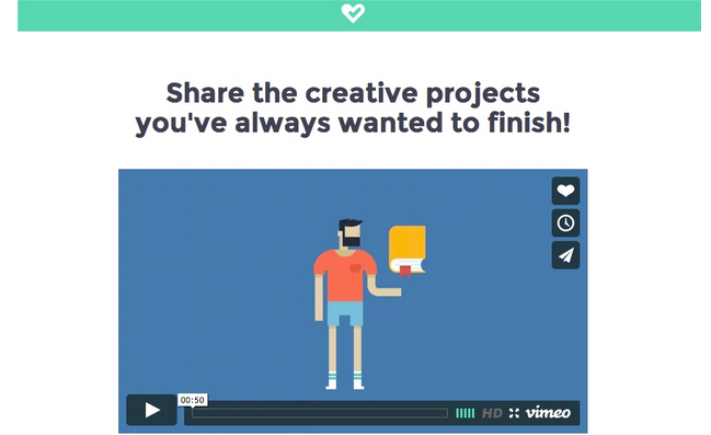
- Video — an optional but desirable component. A short video can demonstrate the functionality of the app.
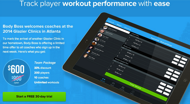
- Triggers and calls to action — they should make a user get to the final goal — app install.
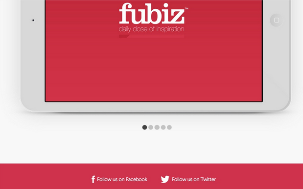
- Social buttons — with their help anybody can easily share the link on social networks.
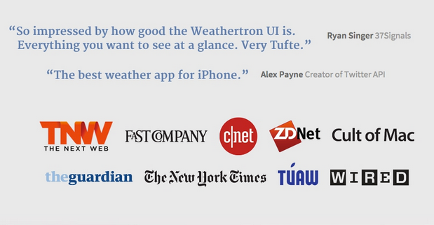
- Links to reviews in mass media — if some editions have written something about you, you should show it to the visitors of your landing.
- The section about app creation — it will help to gain users. For example, you can place designer sketches showing the evolution of your app in the process of creation.

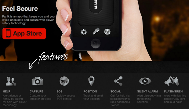
- Feature list — an inseparable attribute of any landing. Users should learn about app functionality from it.
- E-mail form — it’s used in pre-release landing. On a regular landing, you can also collect visitors’ contacts in order to notify them about updates and news. Besides they will be useful in keeping your users.
How to create a landing page?
You can create a landing page yourself or you can use special services that don’t need you to know HTML so it’s an easier way.
If you want to create a really cool landing with an individual design then go-to specialists. You can order a landing page from freelancers as well. If you want a more quality result, order it from a studio.
The success of an app depends on the quality of the landing page. Because it’s one of the steps a user makes towards your product. Strive for getting more people who visit your landing page to install the app.
Read more about mobile app promotion
- Part 1 Choosing a niche
- Part 2 Typical strategies
- Part 3 App Store and Google Play rules
- Part 4 Choosing app name
- Part 5 Screenshots and app description
- Part 6 App icons
- Part 7 Making up a marketing plan
- Part 9 Preparing banners
- Part 10 App localization
- Part 11 App monetization: banner advertising
- Part 12 Incent traffic
- Part 13 Featuring
- Part 14 Review of app business-models
- Part 15 TOP algorithms
- Part 16 Video on the app page
- Part 17 Promotion in mass media
- Part 18 Alternative stores
- Part 19 Reviews and ratings in the stores
- Part 20 Analysing competitors
- Part 21 Viral mechanics in app promotion
- Part 22 Soft launch
- Part 23 Selling triggers
- Part 24 App design A/B-testing
- Part 25 App of the Day
- Part 26 Retargeting
- Part 27 Promotion in social network communities
- Part 28 App tutorial
- Part 29 App authorization forms
- Part 30 Mobile advertising in video networks
- Part 31 How do trackers work?
- Part 32 Main efficiency metrics of mobile advertisements
- Part 33 Search in app stores
- Part 34 Pre-installations
- Part 35 Push-notifications


