Icon is an inseparable attribute of any mobile app. It’s what catches a user’s eye when he/she is searching for something in a store. That’s why it’s necessary to pay a lot of attention to it as the success of the app depends on that tiny detail. In this article, we’ll tell you about the right approach to creating an icon.
Contents
App icons
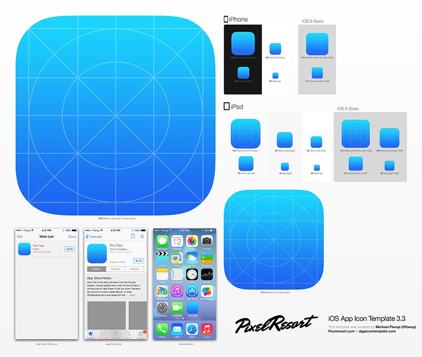
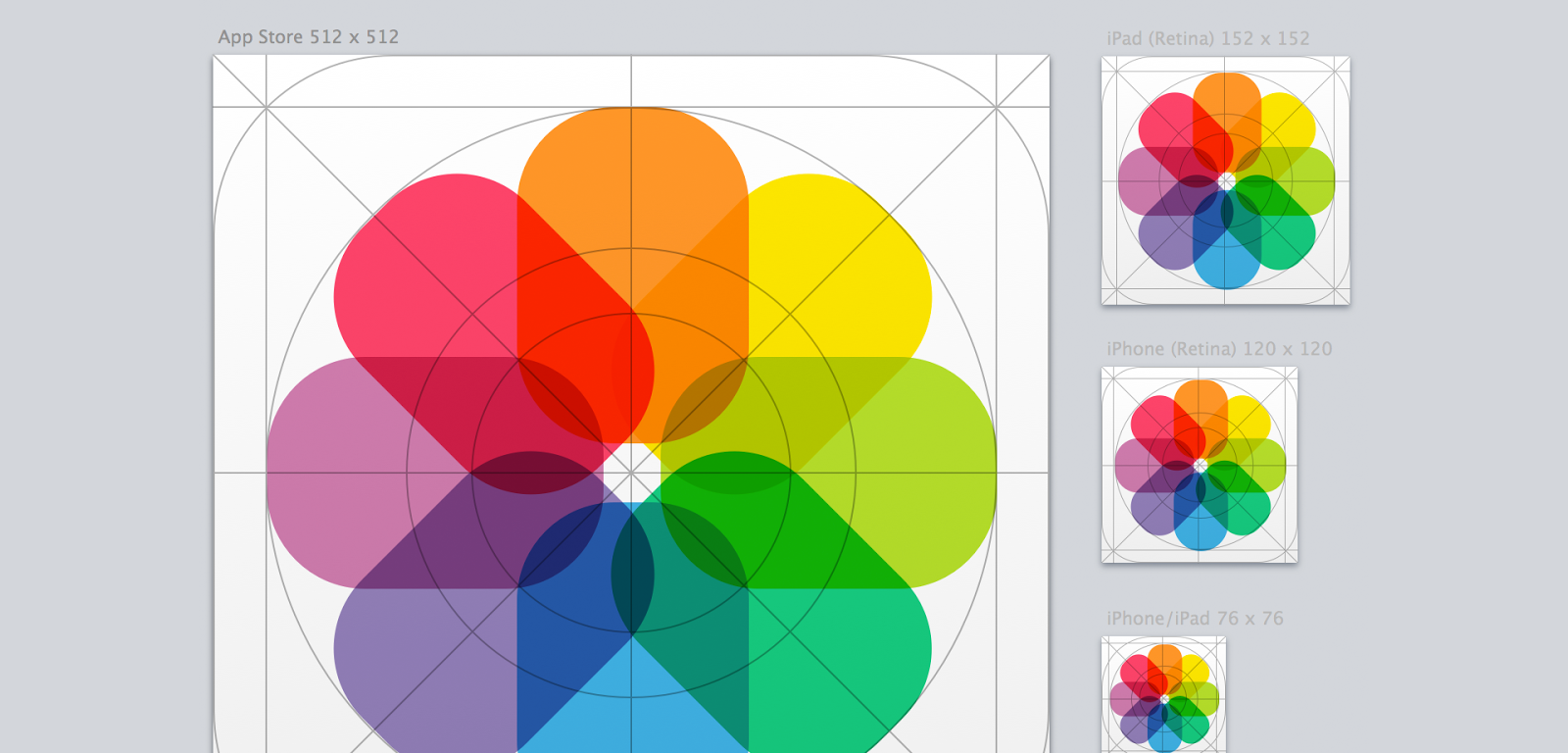
You should learn thoroughly app store rules before creating or ordering an icon. It may seem that you need a small square picture with a side size of 57 pixels, the one users are used to see on their iPhones and iPads. But it’s more complicated than this. A whole set of initial graphic files is needed and their size may reach 2048 pixels. Moreover, each store has its own demands. Google Play needs only 5 sizes while App Store needs 9. Pay attention to the icon sizes for devices with Retina screen as they need special sizes for the correct display.

Design peculiarities
It seems that designers are limited as the icon canvas is so small. But that’s not true. There are real masterpieces among icons and when you look at them it’s impossible not to install the app. So what are the elements of a successful icon?
- A design should reflect the essence of the app. If you release a war strategy, you should use a picture of guns or soldiers on the icon. If the app is connected with music, place conventionalized notes or musical instruments on it. Don’t confuse users. Help them to easily identify app content.

- Remember that icon is an essential marketing element. Make it appealing so a user would want to install an app because of it.
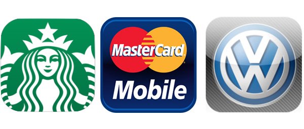
- If an app is connected with some brand, a user should recognize the trademark from the icon. So it’s better to use a logo.

Here are some more useful tips:
- Don’t repeat the app name in the form of a text on the icon. Do it only in exceptional cases.
- Don’t overload an icon with a great number of objects as it impairs perception.
- Avoid using a wide range of colors. It’s enough to use 3-4 basic colors.

- If you launch a series of interconnected apps, use the same creation principles for all of them.
- Study the audience thoroughly and watch over your competitors before creating an icon. Maybe you’ll have to keep to one style.
Don’t be afraid to change icons but be careful so all the versions would be 100% recognizable. Such a step will help to remind you about yourself the users who have installed an app but don’t use it. Holidays or change of seasons may be a great occasion to do so.
Ordering an icon
There are a great many free services for automatic icon creation for mobile apps throughout the web. But it’s impossible to create a great icon with such tools. There is another way — stocks or such resources as thenounproject.com which are better than the first ones. You can buy an icon there at quite a cheap price. But it’s an option for those who cut down their expenses.
A better choice is to order an icon from professional designers. You can find them among freelancers. But it would be perfect if you turn to designer studios as they give a more quality result and it’s safer to work with them. We would like to recommend SoftFacade.
Don’t expect that after 3 days you made an order you’ll get a ready-made masterpiece. The process of creating app logos is multistage. Terms depend on the tasks you set, designer and many other factors. If it’s a complex case and needs a lot of work but a designer insists he/she can do it in a day, you should prick up your ears.
In order to create a really quality and alluring icon, you should give a designer maximum information about the content and target audience, describe your request in a detailed way. But don’t fill up a designer with your sketches, especially if you’re not good at designing. It will only complicate your interaction and prolong the terms.

If you already have some ideas, make a sketch or draw on a paper that you want to see on a future icon. Having created a concept, you’ll help a designer and speed up the work.
The principle of creating an icon depends a lot on the app-specific character. Sometimes designers create several variants and you can choose the best one. But other times only one variant is created.

For some apps you can use a method of evaluation against competitors’ background, i.e. an icon is placed among other apps on a store screenshot. In such a way you can see and estimate it in the environment it’s created for.
Sometimes you can follow a correlation between icon color and app categories. For example, many social networks use blue color variations, messengers — green color variations. But there are wonderful examples which prove that you shouldn’t keep to any color rules all the time. Be brave, declare about yourself using another color. If there are other goals, then try to blend in.

An important technical moment: order all the necessary icon sizes at once. If you make automatic resizing with the help of the ordinary graphic editor, you’ll be disappointed as the quality of the picture will suffer a lot. That’s why you should trust the procedure to designers who will create a unique icon for each size.

Testing
Before launching the app, test the icon on a group of people conforming to your target audience. You may also ask your friends to help you.
Don’t show them all the variants separately, surround them with competitors’ icons. But choose the one which attracts the most attention. Poll is another effective approach. Create an anonymous poll without showing results. You can publish the link to it on your social networks or blog in order to cover more audience.
Besides, take into consideration that users may have installed various wallpapers. Choose the main color variations and test the icon on them. Maybe it’ll blend with some of them and you’ll have to change the icon.
The icon directly affects success of the app. Stay within the limits of store rules while creating it. Be creative and don’t be afraid to experiment. Thus you’ll be able to create a work of art and users will vote for it by installs.
Read more about mobile app promotion
- Part 1 Choosing a niche
- Part 2 Typical strategies
- Part 3 App Store and Google Play rules
- Part 4 Choosing app name
- Part 5 Screenshots and app description
- Part 7 Making up a marketing plan
- Part 8 Creation of a landing page
- Part 9 Preparing banners
- Part 10 App localization
- Part 11 App monetization: banner advertising
- Part 12 Incent traffic
- Part 13 Featuring
- Part 14 Review of app business-models
- Part 15 TOP algorithms
- Part 16 Video on the app page
- Part 17 Promotion in mass media
- Part 18 Alternative stores
- Part 19 Reviews and ratings in the stores
- Part 20 Analysing competitors
- Part 21 Viral mechanics in app promotion
- Part 22 Soft launch
- Part 23 Selling triggers
- Part 24 App design A/B-testing
- Part 25 App of the Day
- Part 26 Retargeting
- Part 27 Promotion in social network communities
- Part 28 App tutorial
- Part 29 App authorization forms
- Part 30 Mobile advertising in video networks
- Part 31 How do trackers work?
- Part 32 Main efficiency metrics of mobile advertisements
- Part 33 Search in app stores
- Part 34 Pre-installations
- Part 35 Push-notifications


