


Christopher Ratcliff, the Econsultancy editor, has studied the most popular mobile apps and compiled a list of little UX solutions that attract users to a service.
Contents
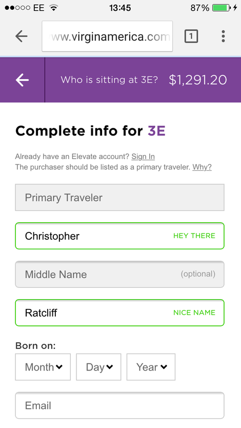
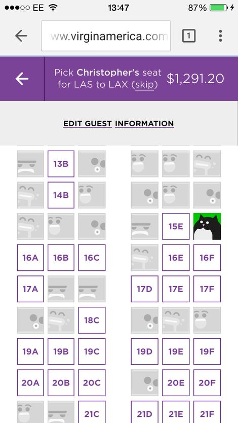
Virgin America
The company uses unusual prompts for entry fields. For example, ‘Hey there’, ‘Nice name’.
While choosing a place in a plane, the website offers to add a photo that other registered passengers will see.
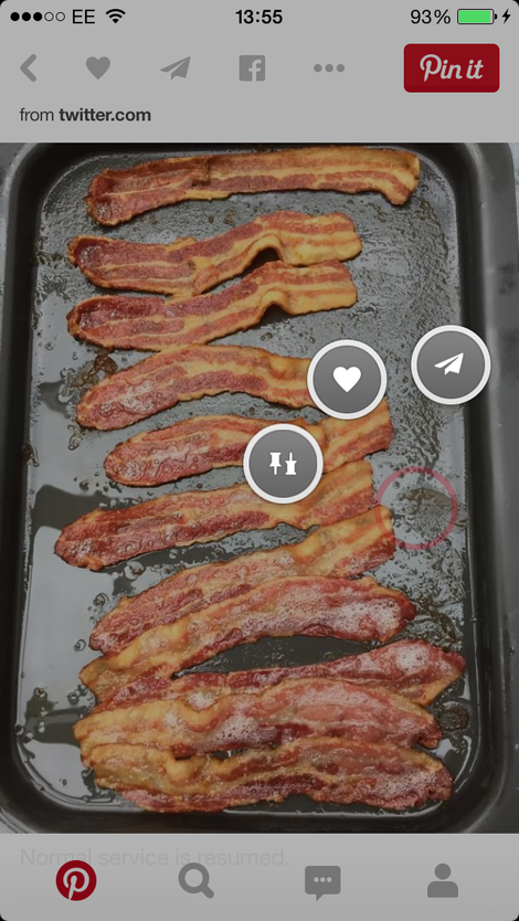
“Share” buttons appear in Pinterest app if you press a picture for a long time (like pressing a pin).
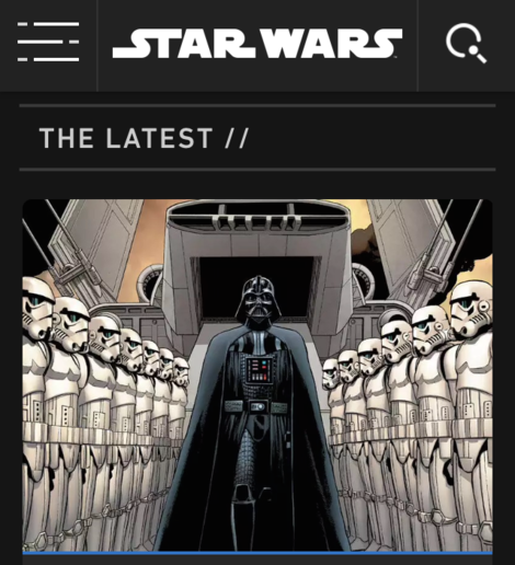
Starwars.com
“Close” button is made in the form of crossed swords from the movie.
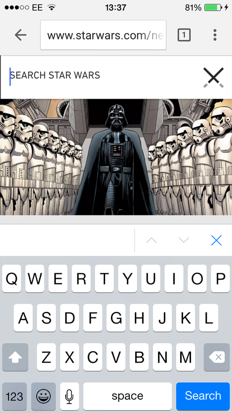
The search button is made in the form of a death star.
MyFitnessPal
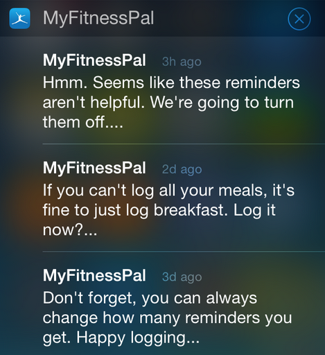
Notifications are switched off automatically if a user doesn’t react to them.
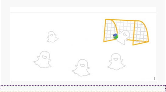
Snapchat
The team of the messenger has added an animation during FIFA World Cup which appeared every time a user scrolled the feed till the end.
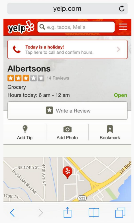
Yelp
If a user searched for a facility on a holiday, the service offers to call a cafe or restaurant to ask the working hours.
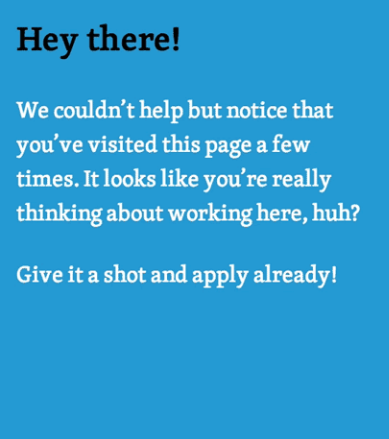
Automattic
If a user of Automattic recruiting service visits a vacancy page several times, the service shows a message with an offer to write the employer.
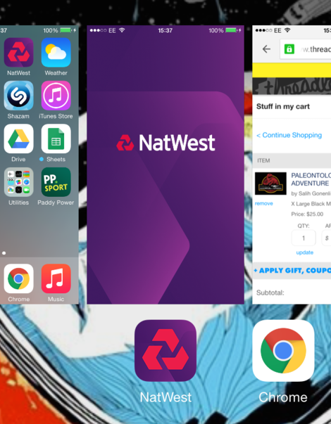
NatWest
While switching the screens in iOS, the NatWest bank app hides user information.
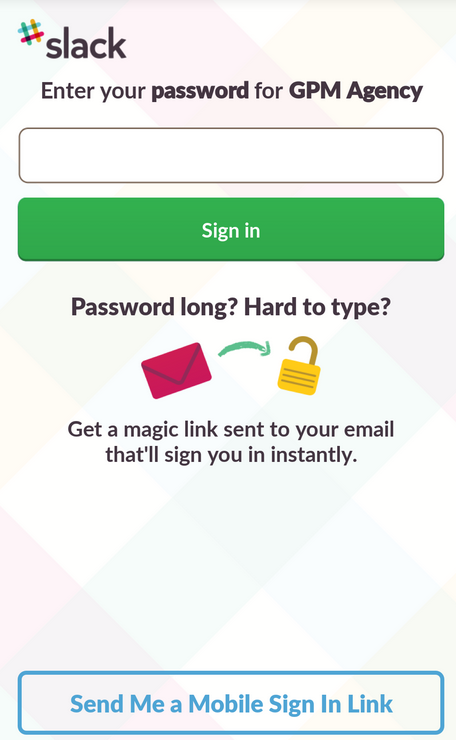
Slack
Slack team messenger offers not to enter a password manually but to get a link for a quick authorization.
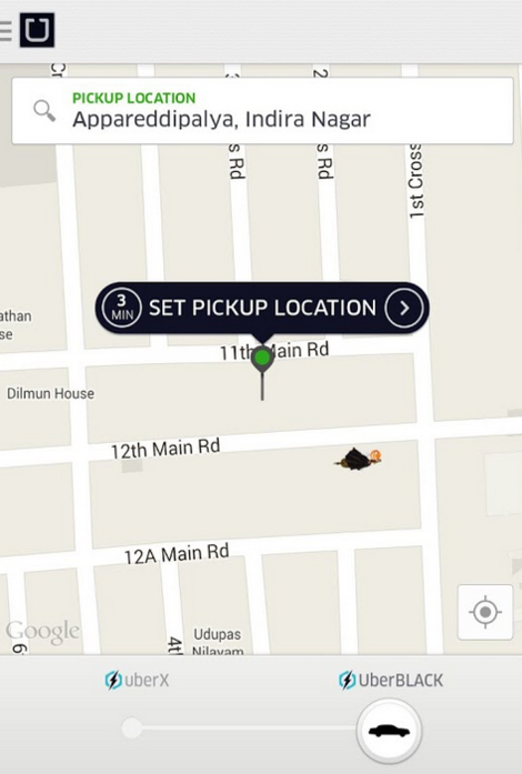
Uber
Uber changed car icons in the app for Halloween.