


It can be quite difficult to create a high-converting landing page. Jacob McMillen assures that he won’t give the “perfect landing page” tip as there’s plenty of contradicting info and concepts and there are a great many of nice landing pages with a high conversion that are totally different.
So, in this article Jacob has compiled 31 examples of outstanding landing pages that are worth seeing. He also describes the reasons why they are brilliant and provides resources and tools which will help you to achieve the same level of success.
Homepage Landing Pages
Contents
1. Gumroad
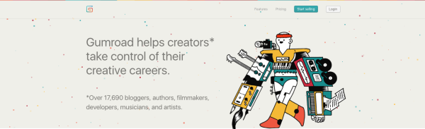 In spite of a “ludicrously ugly” design as Jacob says, Gumroad is a prototype of a landing page.
But still there’s something appealing to it like in many other “ugly” websites that have quite high convertion rates.
Gumroad proves the idea that great spotless design is overrated. The hero shot does everything they need to:
- The laser is aimed at the value proposition which identifies the target audience and includes the benefit.
- The sub heading tells about the target market + a social proof: a user will join “17,000 writers, filmmakers, musicians, software developers, bloggers, and more.”
- The second part of the value proposition explains the “how”: “An all-in-one solution to sell your work and grow your audience.”
- If you move down the landing page, you’ll see a dashboard screenshot with a scroll-into-view image of how the front-end would look on a smartphone. The key thing here is that potential clients see a real view of the product.
2. IMPRESS
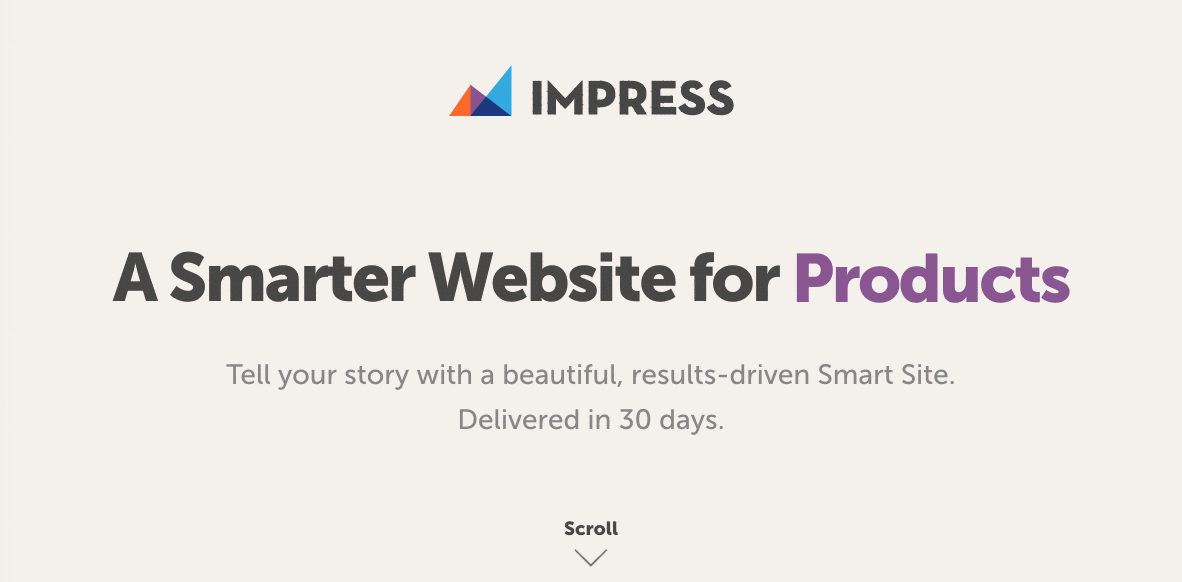 IMPRESS is the total opposite to Gumroad. It’s quite easy to create a WordPress site and make it look nice. But it’s much more difficult to build a website with a scrupulous, creative design which is presented in the IMPRESS portfolio.
They claim that they unite artistry and result-driven design. What’s more, they set a concrete deadline to when a potential client can get a website done: “Delivered in 30 days.”
Delivery delays and missed deadline are a very widespread problem. IMPRESS has included this point to the value proposition and this is a really great advantage.
There are some more elements as you move down the page:
- IMPRESS demonstrates website features it can create on the page.
- Everything is clean on their landing page. (“Ugly” wouldn’t work for a web design agency).
- IMPRESS has a portfolio that is easy to access.
If you want to get your own nice graphics at an inexpensive price, go to 99designs.
3. Groove
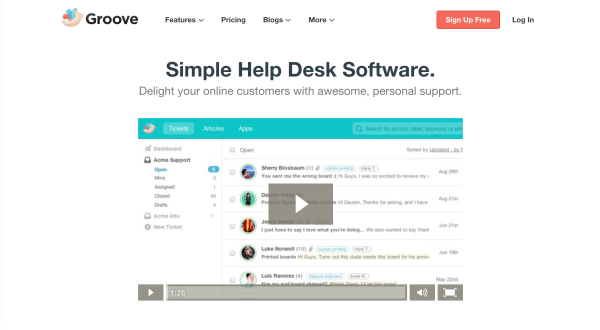 Groove’s homepage is simple and clear. Once they’d got $50,000 monthly revenue, a redesigned followed and increased conversions by 100%.
Both the homepage and the product itself are created to achieve a simple and easy goal. They acquaint their visitors with the SaaS company with the help of an enjoyable explainer video.
There are some really great things on their page:
- The words “delight” and “awesome” in the value proposition create a touch of personality.
- Groove offers the advantages that potential clients are looking for: a software that is easy to use and help to make their clients happy. There are also a usual list of all key features if you don’t want to watch the video.
- Groove has placed a high-contrast CTA button on
- And don’t forget the CTA! Groove does a fantastic job of keeping a high-contrast CTA button on-screen around 70% of the time via 3 different buttons.
Groove understands very well that it’s extremely important to provide users an instant possibility for conversion and they have realized the idea on their landing page.
Moovly gives a free option to make an explainer video of your own.
4. Mark Manson
Most of personal development advice online usually suck. The reason for it is that all of the people giving them seem like they are obliged to share them.
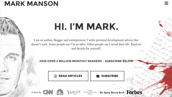
But Mark Manson states that he has some personal development advice that “doesn’t suck”. And it seems to be true.
There are some cool things on his landing page:
- He states directly that what he offers “doesn’t suck”. It’s essential as people would be sure of the contrary.
- He uses an intrigue that makes people bate their curiosity: “Some people say I’m an idiot. Other people say I saved their life. Read on and decide for yourself.”
- He offers his visitors a possibility to subscribe immediately. It’s a great thing to do as the chances are greater that those who haven’t subscribed at once will subscribe later on.
- There are four topical areas that provide a possibility to choose a category that appeals most.
- There’s also a feed of latest article and a CTA that offers people to look at Mark’s posts.
Learn how to hire a graphic designer, if you similar graphics-based web development.
5. Unbounce
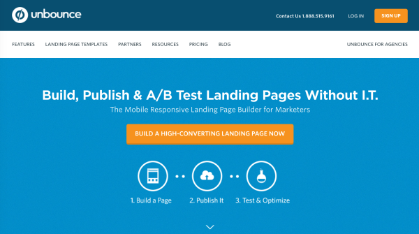
Unbounce is a company that specializes in building landing pages. So, they must know everything about them.
- They offer a concrete benefit without a definite problem.
- They also use high contrast: the blue and the orange. And, by the way, higher contrast increases conversions Jacob McMillen
- Pay attention to the steps on the page. Jacob McMillen explains this: “The more you can help readers get a mental handle on exactly what you’re offering, the better your page will convert.”
As for the icons, don’t overdo it. It should be a navigation enhancement, not a replacement.
- There’s a social proof right after the value proposition displaying famous brands they’ve worked with.
- They a set of more than 200 templates for people to get acquainted with.
Read Copyblogger’s free ebook “Magnetic Headlines” to master your skill of writing cool headlines.
6. Gravity Payments
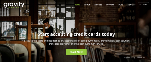
In order to achieve success, find out what appeals to your target audience. That’s what Gravity Payments have done. Their landing page creates a sense of “trust, which increases conversions.”
They are addressing specifically you (use your imagination), a small business owner: “We reduce the costs and headaches of accepting credit card payments by providing low-cost solutions, transparent pricing, and the best customer service.”
They are the “Credit Card Processing Trusted Most by Community Businesses”
Then, company core values follow concentrated on building trust and there are also some wonderful testimonials.
Learn more about the value proposition here.
7. KlientBoost
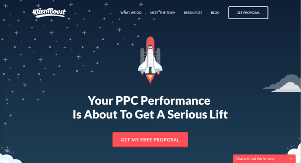
There are 2 things that KlientBoost’s do perfectly.
- They use an attention grabbing, unique design. It’s pleasant to people’s eyes for its artistry and is uncommon for marketing websites.
- They use “You” a lot.
The most important thing here is their concentration on the client.
8. ConvertKit
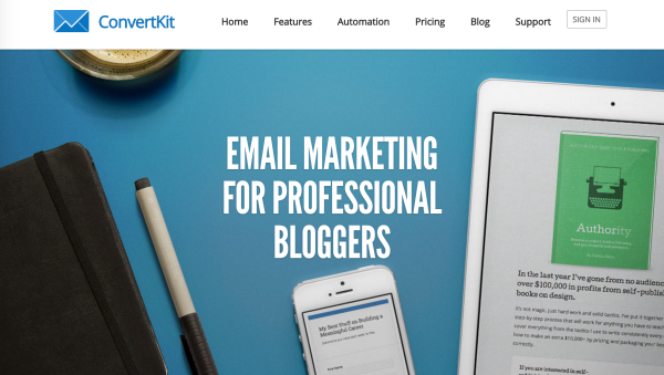
Focus, a concentration of a landing page on a specific audience, is what makes an awesome landing page.
And this is what ConvertKit has managed to do. They target at pro-bloggers who “need and understand the functionality their software provides.”
- The homepage starts with the presentation of who they are and a short video displaying the most important things. But remember that you should provide a reason for visitors to watch the video.
- ConvertKit offers a range of blogger-focused features that other similar services don’t.
9. SumoMe
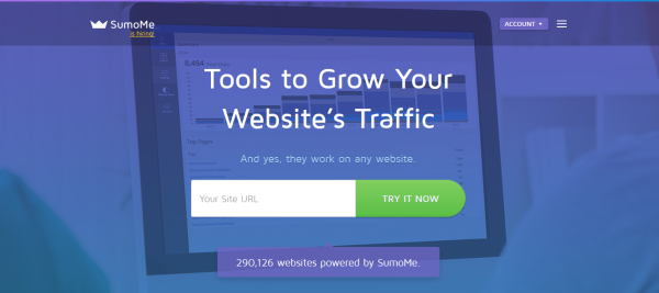
To every sales pitch, there’s an objection and the most important thing here is to cover them before the moment clients think about them. Otherwise, everything you have to say won’t be convincing.
SumoMe cover objections and give confidence to the readers that everything they read on the landing page is applicable to them.
Lead Magnets, Guides, eBooks & More
10. Social Triggers

Derek Halpern’s name is famous in the world of online marketing and his personality and sense of humor has played an important role in his success story.
We find out from his page that Social Triggers is Derek Halpern. Everything revolves around his personality: the website, the marketing, the brand and the product.
- The reason for this is that personalities sell better. A person tends to follow a person: deep experts, lively communicators and so on.
- The page also invites people to choose one of four free offers (each one appeals to different segments).
- Then follow articles and social proof.
11. Noah Kagan
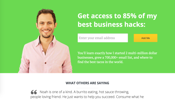
Noah Kagan is a master at email marketing and he doesn’t change his web design every year.
He asks to leave your email address and promises to share the expertise he achieved starting two multi-million business.
Everything is simple on the page: headline, email collection and description. Plus 2 testimonials that create a feeling that he can be your friend and a business colleague at the same time. Then an invitation to read the blog follows.
There aren’t many details on the landing page and that’s the key. Simplicity may work very well.
You can copy this look with the help of Welcome Mat.
12. Michael Hyatt
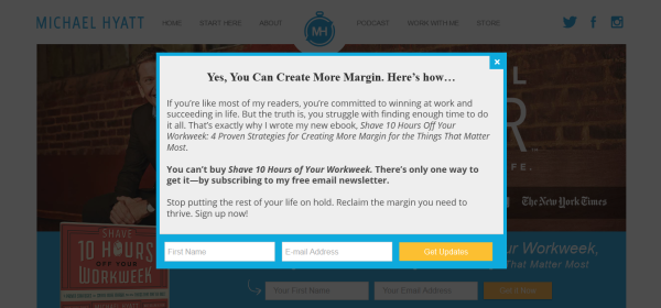
Popups make visitors become subscribers and that’s why many landing pages and especially optin pages use them. It’s an instant decision for readers: to opt in or opt out.
Unlike many other pages that wait a little bit before showing popups, Michael Hyatt shoots a popup almost instantly.
Why does he do it?
- The popup concentrates on the benefits and increases the value (the materials can’t be bought, only offered to subscribers). Everybody loves exclusive things.
- Pay attention to a very personal and direct final sentence that appeals to visitors: “Stop putting the rest of your life on hold. Reclaim the margin you need to thrive. Sign up now!”
Popups are very effective for increasing signups as they place a message right in front of readers.
Here’s SumoMe’s Listbuilder plugin to install a pop-up of your own.
13. Bryan Harris
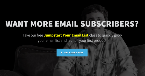
Bryan Harris is one of thought-leaders in email list building. And it’s fair that he has a gorgeous email optin page.
Answer a question: “Want More Email Subscribers?” Cool, here’s a place to sign up.
If you don’t subscribe, you’ll be shown social proof and a possibility to select what exactly you need help with.
If it’s not enough, a deep, personal discussion follows covering how Bryan could solve common problems and invites visitors to join.
14. Jon Morrow
Jon Morrow is the top blogger, the most successful in the world. He can boast of millions of sales and millions of readers.
Take a look at his optin page.
It’s simple: you do want to read the guide or you don’t.
Why such pages work? The reason is they display a highly compelling offer. The only possibility to continue is to subscribe.
Read carefully this list of great lead magnets for squeeze pages.
Lead Capture
15. Neil Patel
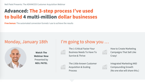
Recently, Neil Patel has made an optin page out of his NeilPatel.com blog. It offers an intro webinar of his marketing training course.
Neil has given away so much free content, that it’s exciting that he is selling something now.
As for the page:
- He establishes expertise by referring to 4 multi-million dollar businesses and effectively 2-upping Noah Kagan (0% chance that’s coincidence).
- A free bonus if offered.
- He shows 4 main insights that will be discussed during the webinar.
- Spots are said to be limited and this makes the webinar an exclusive event.
Add social proof and data to establish expertise if you want to get a page similar to this.
16. KISSmetrics
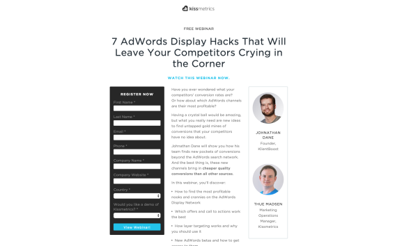
Webinars have become a huge part of KISSmetrics content marketing strategy as it’s a wonderful possibility to collect targeted leads on definite topics.
Let’s take a look at the page:
- In spite of being quite similar to other webinar squeeze pages, it’s still different: neater and cleaner than other registration pages. Only a signup form, description and experts.
- High contrast colors and lively images are used.
- It’s focused on benefits for users.
There are similar free templates, but the ones that would look modern and clean will cost some money.
Check out a list of 600 WordPress themes for less than $20.
17. Brian Dean
It’s impossible to ignite interest in everybody to click-through to your lead-capture page. It would be simpler to get them to a blog post, especially to the one offering worthy and exceptional content.
Brian Dean uses this strategy and creates how-tos and huge guides and makes them subtle lead capture pages. He strategically places offers and downloads on the pages. It’s called a ““content upgrade” and has become a new standard in content marketing and lead capture” according to Jacob McMillen.
18. Buffer
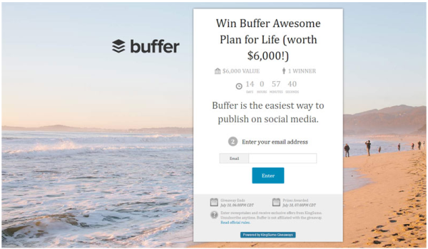
Buffer uses a great strategy that increases subscriber list – giveaways.
Have a look at the page:
- It’s easy to sign up
- Prizes are clearly displayed
- Everything is put above the fold
- There are rewards for users sharing contest
Use KingSumo Giveaways to create a similar giveaway squeeze page.
19. Quicken Loans
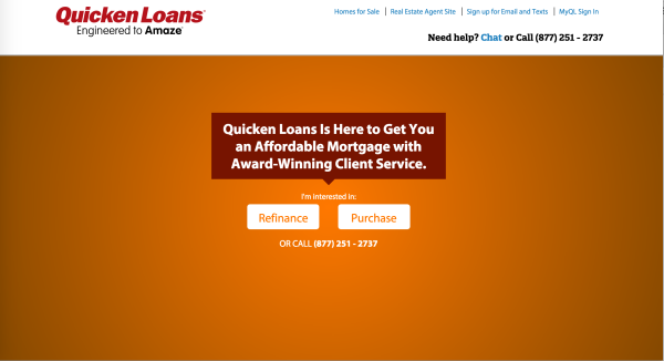
The page has only 2 steps and allows users to get what they need fast.
There’s a choice to visit a specific multi-step landing page or call at once.
Pay attention to the contrasting CTA buttons.
20. BodyBuilding.com
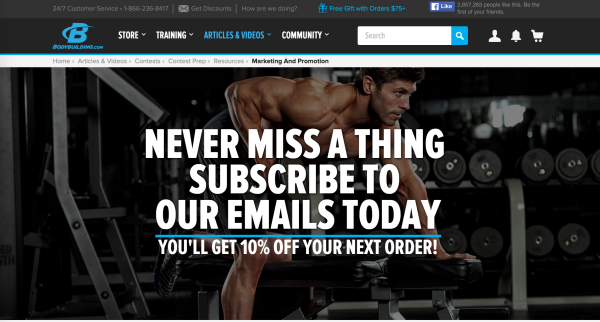
Jacob states that “discounts aren’t as effective, especially in a commodities market where prices are relatively fixed.”
Bodybuilding.com is leading in the sphere of fitness information and supplement sales and a large part of their success lies in their highly efficient email marketing campaigns. They use such pages to get subscribers.
The page displays a good offer but looks a little bit cluttered.
Product Sales Landing Pages
21. Michael Hyatt
Here’s Michael Hyatt’s landing page that he uses for selling books. It’s a standard WordPress Page but he’s doing very well with it.
- He concentrates on the existing problem (for starters) and tries to solve it.
- Have a look at the sidebar. There are 27 testimonials. So, whenever you look to the right, you see a new comment about how cool product is. Add 20+ reviews to increase conversions by 83.85%.
22. Freshbooks
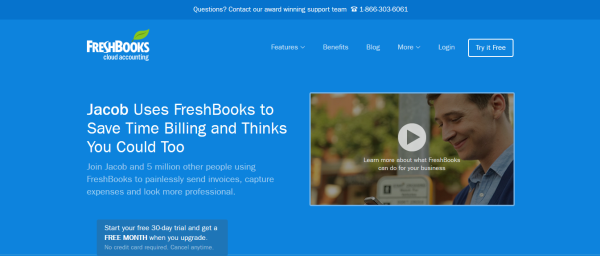
There’s a strategy even more efficient than email and product sales landing pages – referrals.
Freshbooks has implemented it and uses a landing page generator in order to personalize the landing page depending on who refers them.
It’s a very efficient type of landing pages as it creates trust momentarily.
Learn more about the power of persuasion here.
23. StudioPress
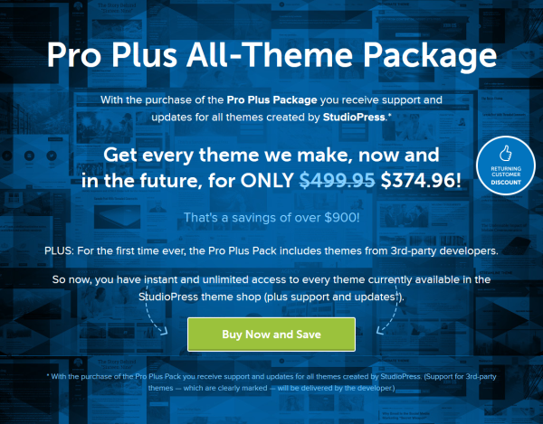
Meet another effective way of increasing sales – sell to your existing customers.
StudioPress uses this idea and offers an “Everything We’ll Ever Make” package to their existing clients.
Try bundling to increase your sales. Pay attention to the way the price is displayed.
24. Tony Robbins
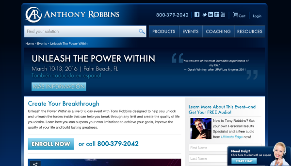
Tony Robbins’ landing page design may look a little bit out-dated but no matter what it proves to be effective.
Here’s the progression.
- create “YOUR” breakthrough
- engaging video
- testimonials by famous people
- pricing options
- over-the-top satisfaction/refund guarantee
The page leaves no chances, promising a “life-changing” experience.
25. MacBook
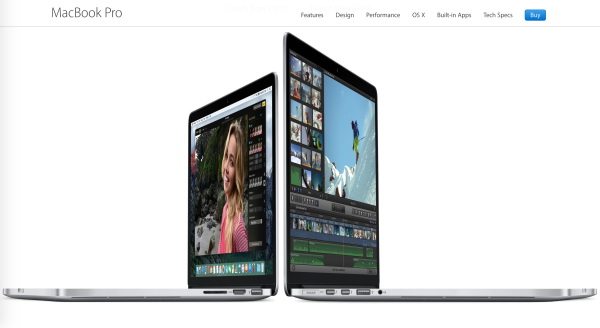
A term “focus” may be applied to targeted customers and to your strength and weaknesses.
Apple products look gorgeous and that’s why they win the competition many times. It’s landing page shows only design and beauty, no performance details, specifications or price.
We see only an amazing hardware.
Use Pingdom’s free site speed checker to make sure that your graphics-driven page loads quickly.
26. John McIntyre
Although long sales pitches aren’t very widespread now, they still can be efficient.
John McIntyre is the creator of such a page for his Mastermind group.
Let’s take a look at prominent elements:
- There’s an autoplay video of John explaining the product.
- It lists benefits and concentrates on the most essential one: increasing revenue.
- At the end, there are video testimonials. It’s a powerful proof that people like the product incredibly.
27. Serious Bloggers Only
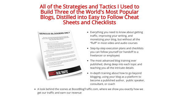
For “Serious bloggers only”.
Jon Morrow offers visitors a 10-minute read on this landing page.
It has it all there: benefits, social proof, frustrations, promises and so on.
Take a look at 30 free landing page templates that will let you copy this one.
28. Dollar Shave Club
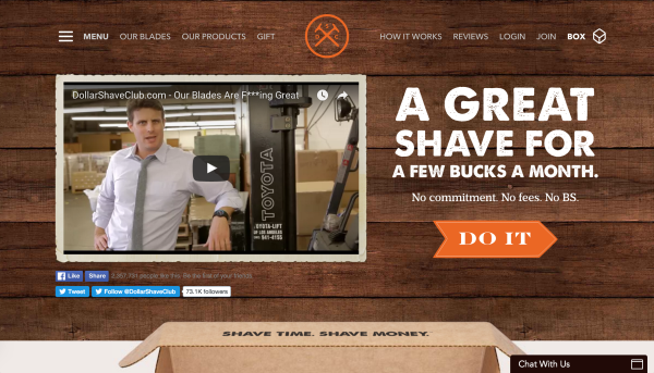
Dollar Shave Club’s landing page unites awesome design with a humorous copy.
There’s also a visual of the product a customer will receive.
It’s short and effective. Creating a cool video to kick off your landing page will let you increase conversions by 20% on average.
Here’s a list For WordPress themes having a great landing page.
29. Craft Coffee
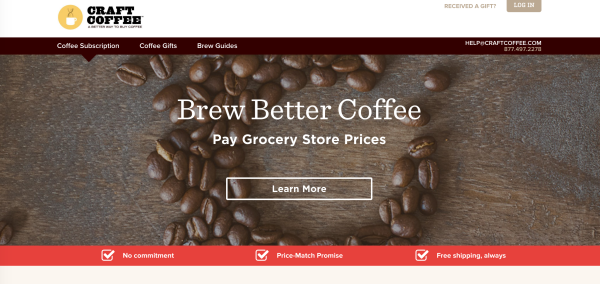
There are plenty of coffee drinkers around the world. Over half you reading the article have a cup of coffee right now.
Craft Coffee’s has a perfect subscription sales page. A superb descriptive headline “Brew Better Coffee. Pay Grocery Store Prices“, a visual “How It Works” and an outstanding Satisfaction Guarantee. By the way, guarantees can affect conversion rates greatly.
30. Etsy
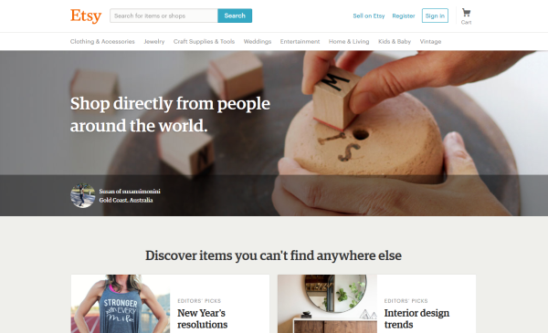
Focusing a single product is the correct way to using a landing page as offering less options tends to convert better.
But here’s an example of a landing page influencing an eCommerce platform.
Right on the homepage visitors find out what it’s all about: “Shop directly from people around the world. Discover items you can’t find anywhere else”.
It makes people understand that it’s an online shop for the individuals who value unique things.
Try CoSchedule’s Headline Analyzer tool to write better headlines.
31. GetResponse
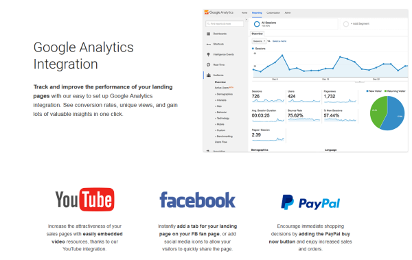
Jacob McMillen states that “If you can offer a supplemental service to something that tons of people are using, you can piggyback on their success.”
GetResponse addresses the 4 platforms that almost everybody uses.
Integration with them isn’t very complex and many services do offer it but not many tell about that.
Try out a landing page builder by GetResponse for free.