Alex Birkett believes that there are no strict rules when it comes to conversion optimization as all sites are contextual. So, something may work great for one site and fail for another. But still, some tactics tend to work more often than not.
Contents
1. Static Image w/ Single Value Proposition Is Better Than Auto-rotating Slider
Are you thinking about using an auto-rotating slider? Here’s advice for you: don’t do it. Don’t use auto-rotating sliders (aka carousels)! Although there are rare cases when they do better than static images, for all the others it’s a usability horror.
“These days so many e-commerce sites use rotating offers – and I think it’s not because they tested it, but due to herd mentality – “others have it, so should we”.
Peep Laja
Why should you avoid using carousels?
Among a great many of reasons, Alex Birkett lists 3 of them:
- people miss important things because human eyes react to movement
- clutter effect (many messages mean no message)
- banner blindness (visually they are similar to banners which people hate and try to ignore)
Users want to have control but auto-rotating is not about that. Use a simple and static hero image instead.
In case you want a carousel, here are some ways to improve it.
Improving the carousel
Tips by Nielsen Norman Group:
- Use up to 5 frames within the carousel.
- Use crisp-looking text and images that coincide with the organization’s charter.
- Indicate how many frames are present, and where the user is within the “progression.” This helps people feel in control.
- Use icons and links that are understandable and recognizable
- Ensure that navigation controls appear inside the carousel, not below it or separated by a fold.
- If offering a navigation button for each frame (rather than arrows to scroll through), ensure that each button looks different, and represents the frame.
- Make links and buttons large enough to decipher and click.
For those who are in search of a redesign, Mightybytes offers a cool resource.
2. Hamburger+”Menu” Wins Over Just Hamburger
Hamburger origin is obscured now. But many people think that it still works. It’s a wrong belief. According to tests, a hamburger + a “menu” label wins over just a hamburger icon.
As a proof, Alex Birkett publishes a test they did some time ago. They tested 3 icons and a hamburger icon+menu label in a bright pink color:

Here’s the result:

Some people do like hamburger icons, but there are just reasons why you shouldn’t use them:
- ambiguous.
3. Proper Value Proposition Beats No Value Proposition
It may be surprising but many businesses don’t have a value proposition.
What’s a value proposition? To put it one phrase it’s the number one reason why a consumer should buy your product.
Here’s what it consists of:
- Headline. The one that grabs attention. A short, sweet, concise, and relevant offer.
- Sub-headline or a paragraph consisting of two-three sentences. What you offer, for whom and why it’s so good.
- 3 bullet points. The key benefits or features.
- Visual. Show the product, an awesome shot or an image enhancing your main message.
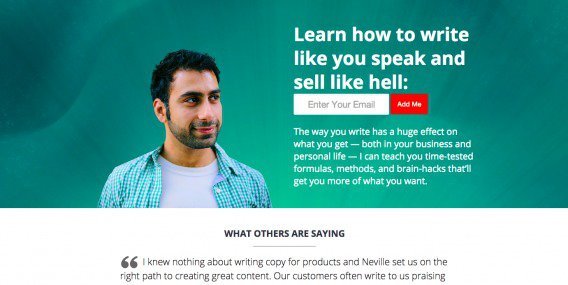
Here’s a good one:
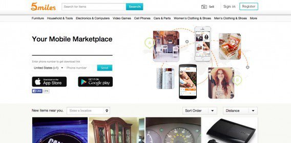
And a bad one:
4. “Sticky” Content
Alex Birkett shares Brian Massey’s quote here:
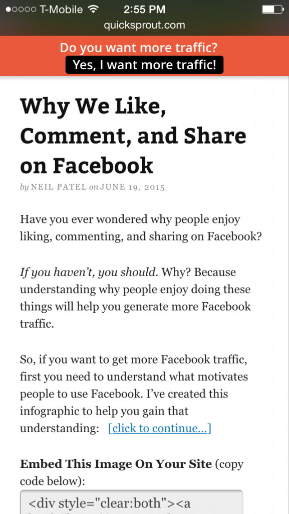
“Our Conversion Scientists have consistently found upside with “sticky” content. On small-screen mobile websites, having a sticky header or footer containing a call to action has consistently increased conversion rates. This call to action may be “Subscribe”, “Search” or “Click to Call”.
One of our clients saw a 400% increase in mobile leads from a sticky header. Note that the target audience here is high-school students, and this data may be skewed.
So effective has this been that we are now testing these on desktop “big-screen” websites. So far we’ve seen one successful test of this.
There appears to be some blindness with footers as opposed to headers. This may be thanks to mobile ads. Who hasn’t learned to hate “Art of War”? We’ll probably see a decrease in the effectiveness on these over time. Visitors will form lexical memories that will make stickies less tempting to click. But right now, they are hot. They are hot because they funnel engaged visitors like crazy.”
This is how sticky content looks like:
5. Product Videos Are Better Than No Videos
Videos usually convert users better than no videos. They can push customers down the funnel and convert them.
According to Matt Lawson, Head of Conversion at ao.com, “when someone watches our video reviews they’re 120.5% more likely to buy, spend 157.2% longer on the site and spend 9.1% more per order.”
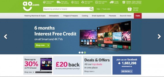
It’s not a universal rule but having a video may improve conversion.
As an addition, here’s a controversial thing: Facebook users consider autoplay video irritating but still they usually convert better. Facebook has tested it and found out that there’s a “10% increase in people watching, liking, sharing and commenting on videos.”
Twitter has done the same thing and they have concluded that:
- People are 2.5X more likely to prefer autoplay videos over other viewing methods.
- They have better video recall with autoplay. In fact, we saw a significant 14% lift in video recall over other video formats.
- For brands, during our autoplay tests, they saw a 7x increase in completions of Promoted Videos.
6. Removing form fields
Another quote that Alex Birkett shares is by Tim Ash, CEO of Site Tuners, Chairperson of Conversion Conference:
“Often we online marketers suffer from “greedy marketer syndrome” and try to collect as much information as possible. One sure conversion killer is asking for unnecessary information on forms. A longer form often looks more imposing and some people will be less likely to complete it simply for that reason. If the actual information is sensitive in nature they will also have a strong adverse emotional reaction to it.
In my Landing Page Optimization book, I proposed the following Form Field Test: “Is this information absolutely necessary to complete the current transaction?” If you can’t answer “yes” to that question, the form field should be removed.”
Have a look at a simple and neat sign up form from Inbound.org:
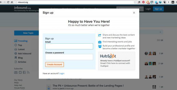
It’s also possible to add form fields if you want to qualify leads.
7. Prominent Contact Information
You may think it’s a trifle, but if you put your email address and phone number on the top of your website, it can increase the number of conversions. It works because it makes people trust you. Look at this example:

To prove this statement, Alex Birkett gives a story how LessAccounting.com conducted an easy a/b test and increased conversions 1.8% by adding a phone number to their website.
Moreover, click-to-call is of a great help when it comes to mobile conversions. Google conducted a study and they found out that 70% of people use the feature. And 61% of smartphone users consider click-to-call to be an essential thing in the purchasing stage.
8. Live Chat
Live Chat seems to be irreplaceable when it comes to great service. And there’s a reason to it: it helps to convert.
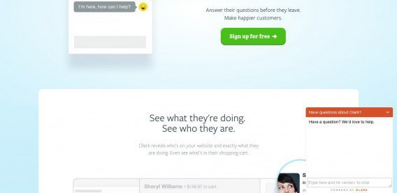
There’s an explanation in Forrester report, “Many online consumers want help from a live person while they are shopping online; in fact, 44% of online consumers say that having questions answered by a live person while in the middle of an online purchase is one of the most important features a Web site can offer.”
Read more in this article on increasing conversions with Live Chat.
9. Trustworthy Testimonials Beat No Testimonials
It’s not a surprise that testimonial increase conversion in many cases as word of mouth is a huge factor in purchase behavior. But keep in mind that that they should be real and trustworthy. Moreover, negative reviews can increase conversion rate. But not too many of them, for sure.
It’s also very important how you display them.
An ideal mixture is a simple testimonial and a photo of a person. Quality photos enhance conversions, but concerning reviews, they add authenticity to the text.
A further step to credibility is to add video testimonials:
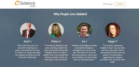
Sean Ellis suggests pulling testimonials from review websites like Yelp: “When you use the testimonials from trusted sites, you hit a trifecta of credibility: authenticity of real customer feedback, published on a credible website, with a more objective bent because it appeared elsewhere on the web.”
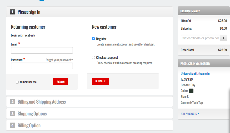
10. Offer a guest checkout option
Adding a possibility of a guest checkout will make converse less smooth. Forcing registration on e-commerce websites creates a hindrance for a customer. To be more precise, 1 in 4 customers leave because of forced registration.
11. Free shipping
100% conversion killer is a charge for shipping. Offer customers some form of free shipping or think of what you can offer instead:
- implement free shipping on orders exceeding a definite sum.
- create a free shipping day.
93% of people polled say that free shipping for orders would urge them to buy more products online.
Here you’ll find more information on the magic of free.
As for how to make free shipping beneficial for you, Andy Hunt describes 4 ways in his article:
- Establish a Baseline: Compare conversion with and without a free shipping offer.
- Create Thresholds: Increase the minimum order value required for free shipping, and test the improvement in margin.
- Set Restrictions: See what kind of improvement you’ll get by offering free shipping only on select products where it is profitable.
- Enact Price Increases: Increase all your product prices to compensate for the loss you take on free shipping, and see how your profit compares.
Conclusion
There aren’t universal things in this topic and your website has peculiar, specific problems. Do a thorough conversion research using a data-driven framework in order to know for sure that you test the right ideas.


