Investigations show that investments in UX result in a decrease of user acquisition price, technical support expenditures and guarantee improvement in keeping users.
Kseniya believes that each dollar invested in UX, turns into 100 dollars. Which is a stunning 9,900% ROI.
That’s why it’s extremely important to pay attention to experience of interaction with users.
UX is a mixture of good design and user understanding.
Actually, organic growth depends on the quality of interaction experience. In order to help you get happy users, Nidhi Shah from Arkanea has gathered the most widespread mistakes in usability and advice on how to solve them.

Contents
Solution to UX problem #1: Decrease loading and setup time (Time to Value)

You hate it, right? So, your users have the same feeling about it. According to the
investigation, 39% of them will shut down a web site, if pictures don’t load or do it too slowly.
Time to Value is a term meaning a period of time between an inquiry for getting a special benefit for a person and its execution. In the context of mobile apps, a user should get an access to an app and content within a maximum short period of time.
Unlike web-users, mobile users don’t come to study your brand. They download an app because it helps them to achieve a certain goal and fulfill a certain task.
So, move on to the task as quickly as possible!
For example, in Uber you need to get from A to B. Here’s how the main app screen looks like:

If you want to bring new users up to date, do it with a minimum amount of steps and explain functionality to them.
Practically, the FTUE (first-time user experience) is connected with key metrics of an app success, such as keeping users, and it can even increase user LTV upwards of 500%.
Solution to UX problem #2: Don’t ask for registration without absolute necessity
Destroy this wall between you and your user. Don’t ask for registration as not every app really needs it.
You may say that registration personalizes user experience. But keep in mind that there’s a significant amount of users you will lose because of a registration request. And they won’t return. According to Localytics research, 25% of users leave an app (and never return) after one session.
If possible, try to give users a possibility to enter an app as guests and leave certain functionality for registered users only. If they like it, they will surely register.

Solution to UX problem #3: Use splash screen for onboarding/tips display
Never make users wait.
Use screen space wisely during app loading. The screen gives a small but vitally important window for keeping users. Give them useful tips in the context of app functionality.

Solution to UX problem #4: Correct mistakes in users’ search inquiries
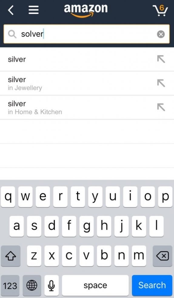
50% of users use a search function as a navigation tool. That’s why it’s important to place a search window on each page of your app. But let’s be honest, remember the last time you googled something, were you 100% sure of the spelling?
Users make spelling mistakes but it shouldn’t prevent them from getting the right result. Offer possible variants of what they may be looking for. Display closely connected words and inform users that their search inquiry is corrected.
Solution to UX problem #5: Display approximate content for new users
It’s likely that there won’t be any information for new users in an app. Instead of showing them empty screens, add some realism displaying approximate content (even if it’s just Lorem Ipsum).

- It’s another way of onboarding, you can softly explain to users how to use your app.
- It can also enhance retention as you lead users to another step.
Solution to UX problem #6: Use visual calendars instead of manual information input
Users hate filling out forms. It’s tiring and boring. So, why don’t you make the process simpler?
The majority of registrations demand a date of birth. Instead of asking to enter the date manually, use visual calendars. It saves time.
Professional advice: By default a year in your visual calendar should be set up for the age of your target audience. For example, if your audience consists of Millennials mostly, choose 1990 by default so that users don’t have to scroll for a long time in order to find their dates of birth.
Solution to UX problem #7: Show progress line for long forms
And again: users don’t like forms. Forms are your personal enemies. Another way to make the process less burdensome is to display a progress line. For all forms longer than one screen try to use a progress line in order to show how much users have already done and how much is left to do.
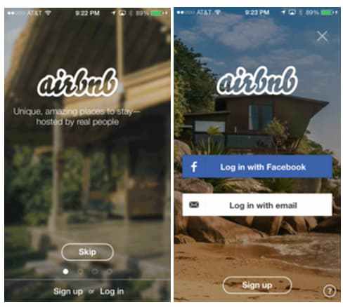
Solution to UX problem #8: Display transitions
When users pass from one screen to another, a question “Where has it come from?” shouldn’t occur to them.
In order not to surprise users with a different interface, use transitions between screens instead of pop-up windows.
Solution to UX problem #9: Save filled out forms
Another point on forms? Yes, because it extremely important!
Even if your forms are as simple as possible, it’s still boring to fill them out. But if a text is deleted because of a mistake, it will surely kill a user’s desire to use the app!
For example: A user spent 3 minutes on filling out such forms as email, contacts, password. Then the page reloads and all information is deleted.
A user will fill out the form again only on condition he passionately desires to use your app. Otherwise, he won’t do it and leave it.
Make sure that the information won’t be deleted because of a typo in an email.
Solution to UX problem #10: Use text “filler”
As a user, I would like to know what information you want from me.
That’s why text “filler” for an empty information field is very useful. It will explain to users what do you want from them.

Conclusion
Nice UX is a good business. So, provide an excellent user experience for your apps and get plenty of benefits. In order to enhance UX of an existing app, you need to evaluate usability of your app firstly.


