Brenden Mulligan, the author of the article, is one of LaunchKit creators, a toolset for iOS developers. He also works on a mobile and web-app Cluster which allows users to create personal networks on the basis of common interests and experience. Also, Brenden is the author of ArtistData and OneSheet projects.
Cluster has become my first mobile native app. Working on it, I’ve realized that I’ve learned so many things including those not concerning web. When you create a web-app, you only create a page for visitors. But when you develop a native app, you not only offer people to download something but also ask them to give you access to their location and personal data. And these are very different relationships.
The main lesson I’ve learned is that you shouldn’t ask for access until you really need the data. Make it very clear what users will get for it.
Contents
It’s very important to get access from the very beginning
The absence of access to data can destroy the whole idea for many apps. For example, if an app work depends on a user location, a refusal to provide geolocation data will make a program useless. Another variant: if push-notifications play a key role in forming a habit of using your program, a prohibition on notifications may lead to a situation when a user forgets about your product.
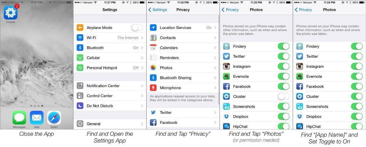
The worst thing is when a user clicks “forbid”, it becomes very difficult to change his/her mind later on. In order to provide access sometime later, a user should make five steps and you can’t help him/her in it if you don’t give users a detailed list of actions.
Order of actions for turning on permissions
In other words, if a user doesn’t provide access, an app will work incorrectly and it will be almost impossible to explain how to fix it. That’s why a developer should do everything possible so that a user clicks “allow”. There are 2 widespread ways.
1. Initial Blitzkrieg (not recommended)
This method is familiar to everybody. You launch an app for the first time and there’s a screen “An app asks for permission to notifications”, then another one “An app asks for permission to a camera”, and then “An app asks for permission to contacts”. If a user doesn’t know the app well, he/she will probably deny all requests. It’s similar to a situation when you come up to somebody in the street and ask them to go on a date with you.
This method was realized in the first Cluster version and only 30-40% of users gave access.
2. Explaining advantages (not optimal enough)
This method is surely better than the first one but still, it’s not efficient enough.
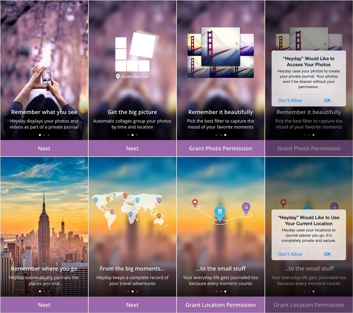
You can see how HeyDay app explains their users why they should give access on the picture below. Then, an app asks for permission. When we used this method in Cluster, 66% of users gave access to our app.
The dynamics of some apps allow to choose one of the two described methods. It would be more correct to explain to users why you need this or that type of access rather than ask them straight away.
How we solved the problem in Cluster
We gathered 2 Cluster versions that show system dialogues of asking for permission after a user informs that he/she is going to provide access.
Dialogues before asking for permission
When we asked for access permission via our own interface before showing a system dialogue, many users agreed to provide it. As we have already said earlier, there’s nothing worse than an access prohibition on a system level as the procedure of turning on permissions is very difficult. But if we ask for access permission before the system does it and a user refuses, there will still be one chance to ask for it again. Maybe, a user will click “allow next time”.
According to our experience, when we asked for access to photos, 46% of users who earlier denied it, were more favorable another time.
It’s simpler than it seems. You can either create your dialogue or use another iOS dialogue.
Double dialogue
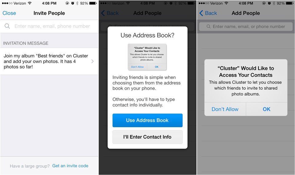
When we asked for access in older Cluster versions we did it twice.
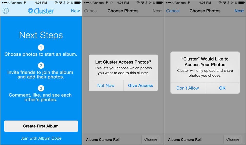
Using a system dialogue twice for a preliminary inquiry.
The first access (the screenshot in the center) placed a user refusal flag in an app, not in the system. I.e. there was one more chance left.
Only 3% of users who clicked “Provide access” then clicked “Prohibit”. I.e. only 2% of users prohibited access on a system level.
It may look a bit busily (asking for permission twice), but we almost eliminate a possibility to get in a situation when a user clicks “Prohibit”. Moreover, nobody hesitated or was confused when the second dialogue appeared in real tests.
You can find here the Initial code.
Educative messages before asking for permission
Asking for contacts access, we wanted to give users more information. But a standard dialogue didn’t allow us to realize our ideas totally. That’s why we created our dialogue which could contain pictures.
Firstly, we explain why we need access and give a choice: give access to an address book or enter the information manually.
The dialogue was only shown in a case when a user agreed to provide access to all contacts.
Just as in the previous case, there were some doubts concerning double dialogue but nobody clicked “Prohibit”. Vice versa, at the moment when those who chose to enter information manually realized what they had really chosen, we nicely offered them to give access to their address book.
Such an approach allowed us to forget about the problem of access prohibition. It was our victory.
Dialogues initiated by users (the most successful variant)
Still, several stubborn people didn’t want to give us access. The main task of preliminary dialogues was to psychologically prepare users to the final inquiry and so that he/she didn’t refuse because of its suddenness. But not everybody clicked “Allow”. We had something to strive to.
Having investigated the problem, we understood that users still don’t expect that they will be asked for permission. Then we had an idea how we could push them to the situation when they would initiate the procedure themselves. While testing it on several dozens of people, almost 100% of people gave access.
Photos
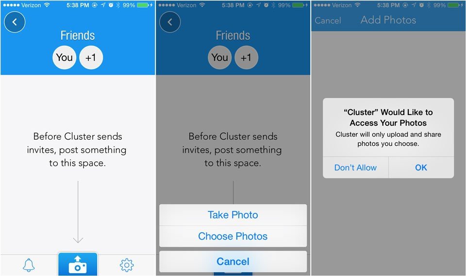
In one of the previous Cluster versions, it was necessary to add a photo firstly. That’s why there was a permission inquiry right after clicking on “Create a cluster” button. 67% of people allowed access.
Then we decided to transfer adding photos to an earlier stage when a user was very suspicious about the app. We also asked them to click a camera icon and “Choose a photo” button before asking for permission.
The number of users who gave access has increased to 89%.
It’s explained very easily: a user is going to upload a photo he/she has made right now and it’s logical to provide access to photos.
Contacts
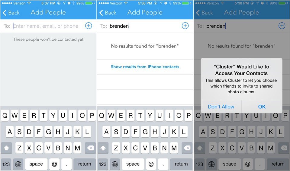
We asked ourselves: What could we give users for access to their address books? It was difficult to offer some evident benefits.
In the end, we decided to show users how sad the procedure of adding a contact looks in prohibited access. After a user found out that he/she can’t find his/her friends and close people in the program, we showed them a “Show the result from the address book” button. Almost everybody clicked it.
100% of users gave us access to contacts as it was their initiative.
Push-notifications
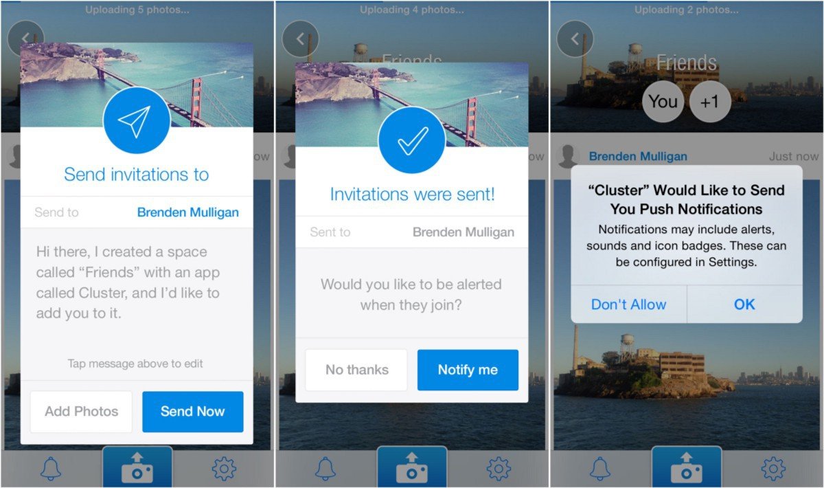
Cluster is used for the creation of small personal virtual space for communication with friends. What benefits could bring our notifications to users? Certainly, information about their friends’ presence in the clusters they’ve created.
When a user creates a cluster for the first time and invites somebody, we ask a logical question: “Do you want to get a notification that your friends have accepted the invitation?”
If a user agrees, we show a standard system dialogue. If he/she refuses, we don’t make him/her to.
After clicking “Notify me” 100% users provided access in a system dialogue.
Importance of context
Apps are different, but its success depends mostly on choosing the right moment when to ask for access to various data and on how you prepare users to it.
Useful links
The links below may be useful to many iOS-developers.
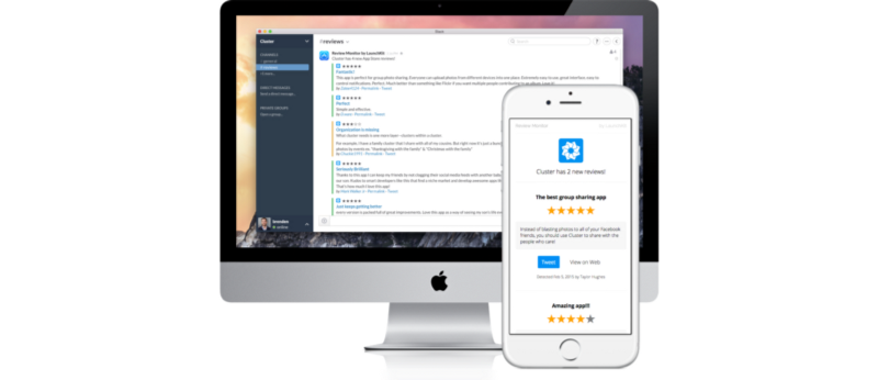
Review Monitor is a free tool that checks the App Store regularly on new reviews. When it finds such a review, it publishes it in its Slack channel or sends it to your mail.
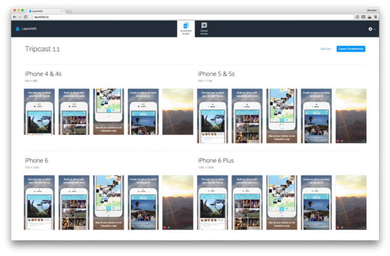
Screenshot Builder allows to easily create beautiful illustrations for your page in App Store exporting it to any resolution you need.


